Brand Identity: What Is Brighter Blaze?
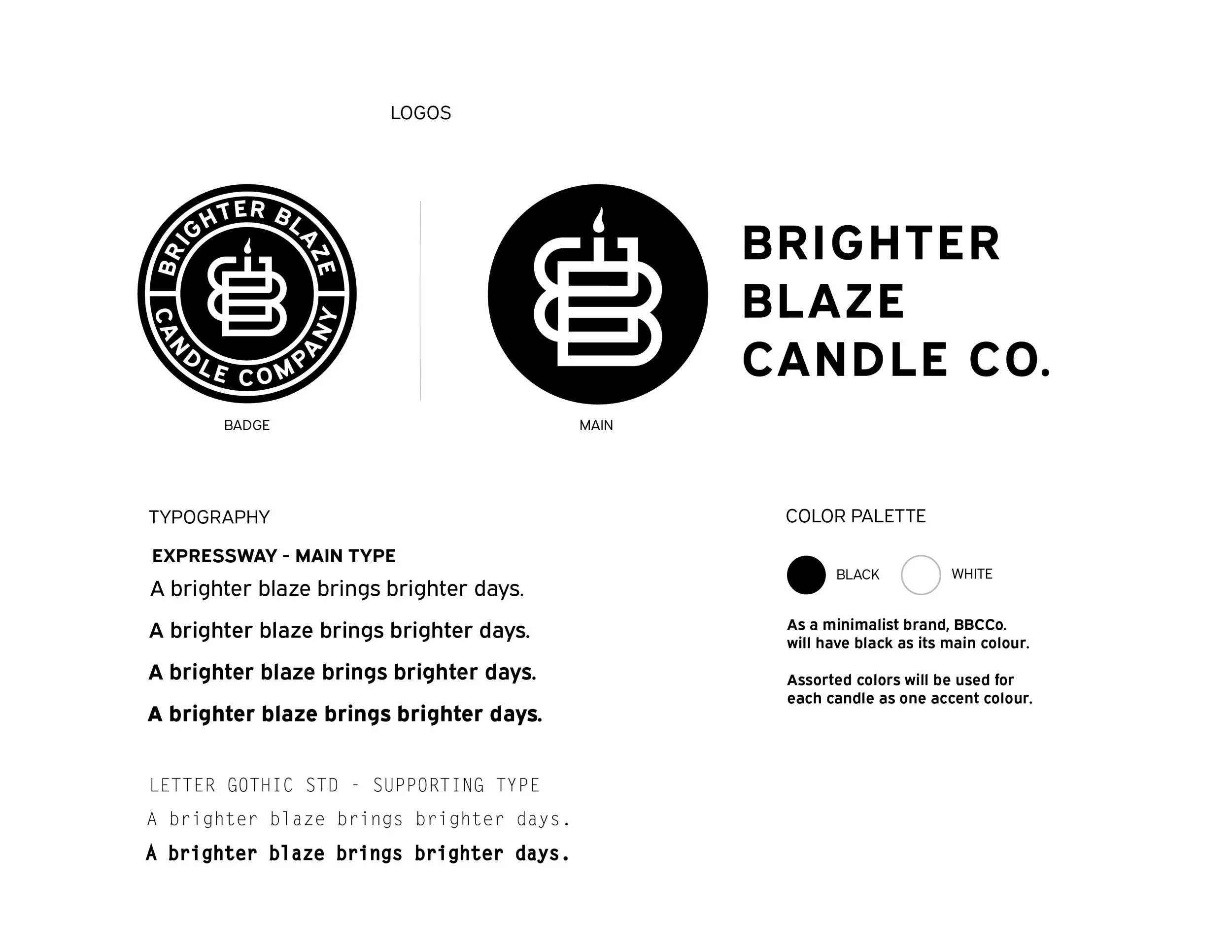
Here’s the visual language of the brand displaying our logos and typography. 👀
Igniting the visual of Brighter Blaze was fun, quick, and came quite natural to me. Overall, I knew that I want to be a minimalist, yet modern contemporary chandlery that values sustainability and simplicity in its products and brand expression. This way, Brighter Blaze Candle Co. appeals to all targets and walks of life, making the candles the perfect fit for any home or space.
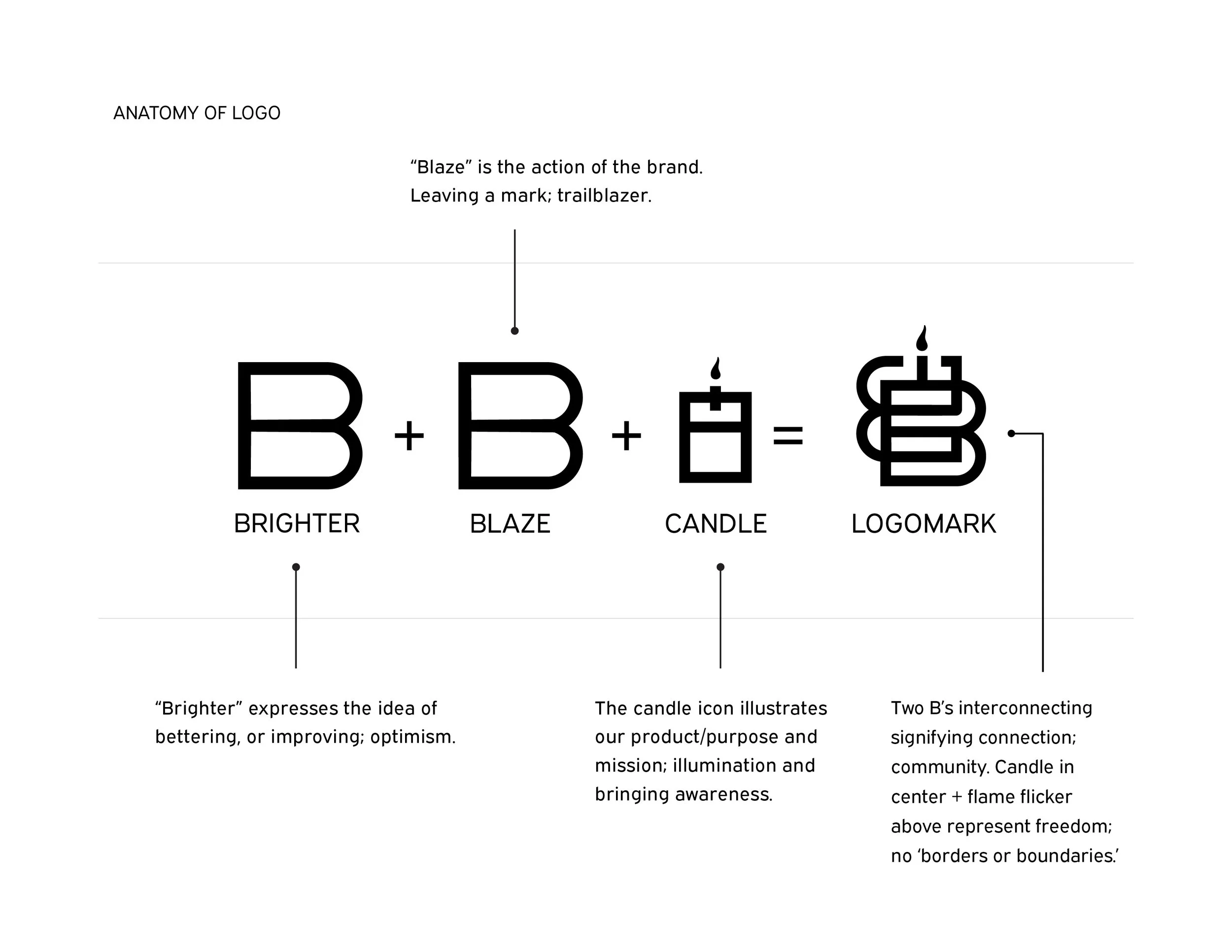
The end result is simple by design, but intentionally layered with meaning. I wanted the harmony of better, brighter days to come through, with “blaze” serving as both a callback to flame and a subtle nod to candle iconography. The logo was crafted to feel structured without being rigid, clean without feeling corporate, and ultimately timeless—a mark that positions itself as a modern classic in the making, much like the brand it represents.
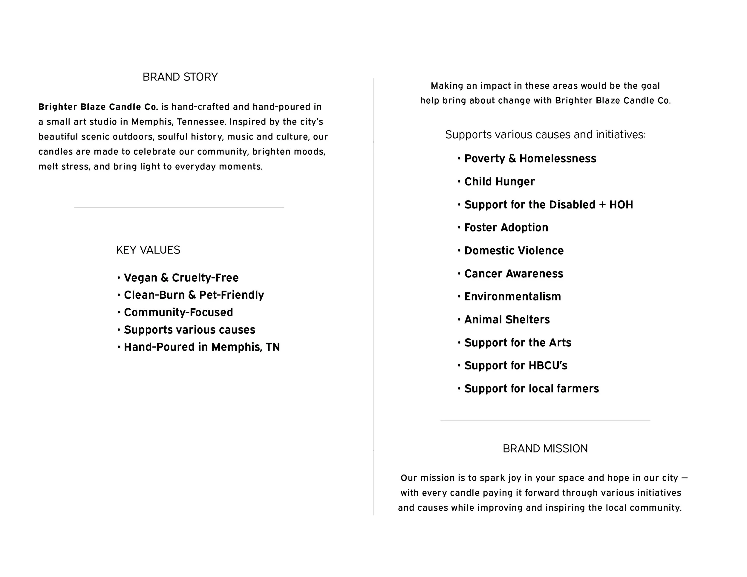
The brand story is inseparable from my personal story. As an artist and natural “maker”, I’ve always expressed myself through making and creating, and I want that same creativity and hard work—poured with love—to give back to my community. Each candle is crafted in my tiny art studio, surrounded by the eclectic energy of Midtown Memphis, making it only natural to connect the work to the community that inspires it.
With my background experience in non-profit and charity work, I plan to pay that inspiration forward by supporting causes and organizations that are deeply meaningful to me and to the people of Memphis.